Devlog #5 - Polish and UI
Content
This week culminated in an extensive testing session, so in order to prepare for it, I spent my time cracking down on making RGB Rumble feel like an actual game. The largest part of this was creating menus and user interfaces of various purposes, but I also polished up some graphics and reintroduced the original, larger level among other things.
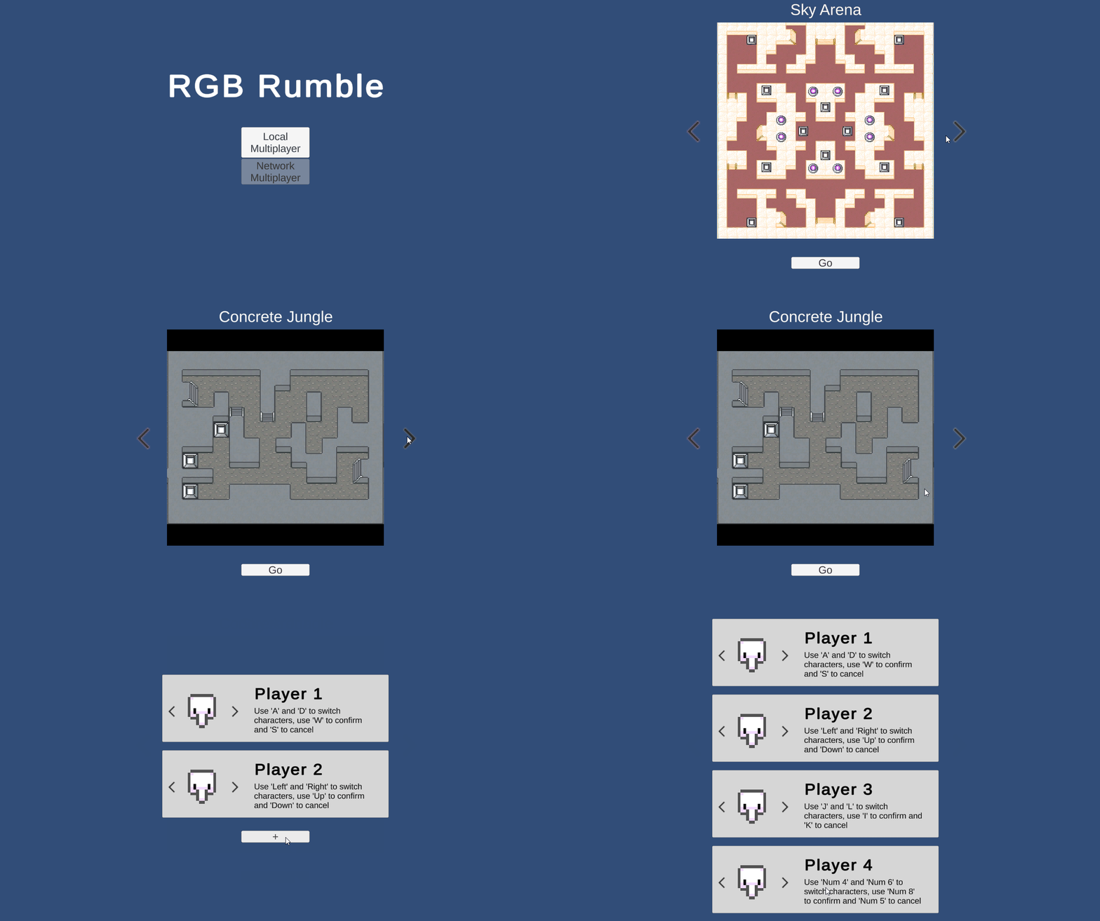
The map selection screen was the easier of the two beyond the title screen. It simply involved cycling through level preview images and storing data relating to which level had been selected. The player menu, however, was much more involved since I had to keep track of multiple player panels that could be added, removed, switched, confirmed and cancelled at any time. It even leaked into scenes other than the main menu as I ended up redesigning how the player objects themselves and their associated UI elements (icons and health bars) are set up at the beginning of a game to account for the variable and appearances of players.
In addition to the main menu, I also implemented two smaller but not unimportant menus to control the flow of the game.
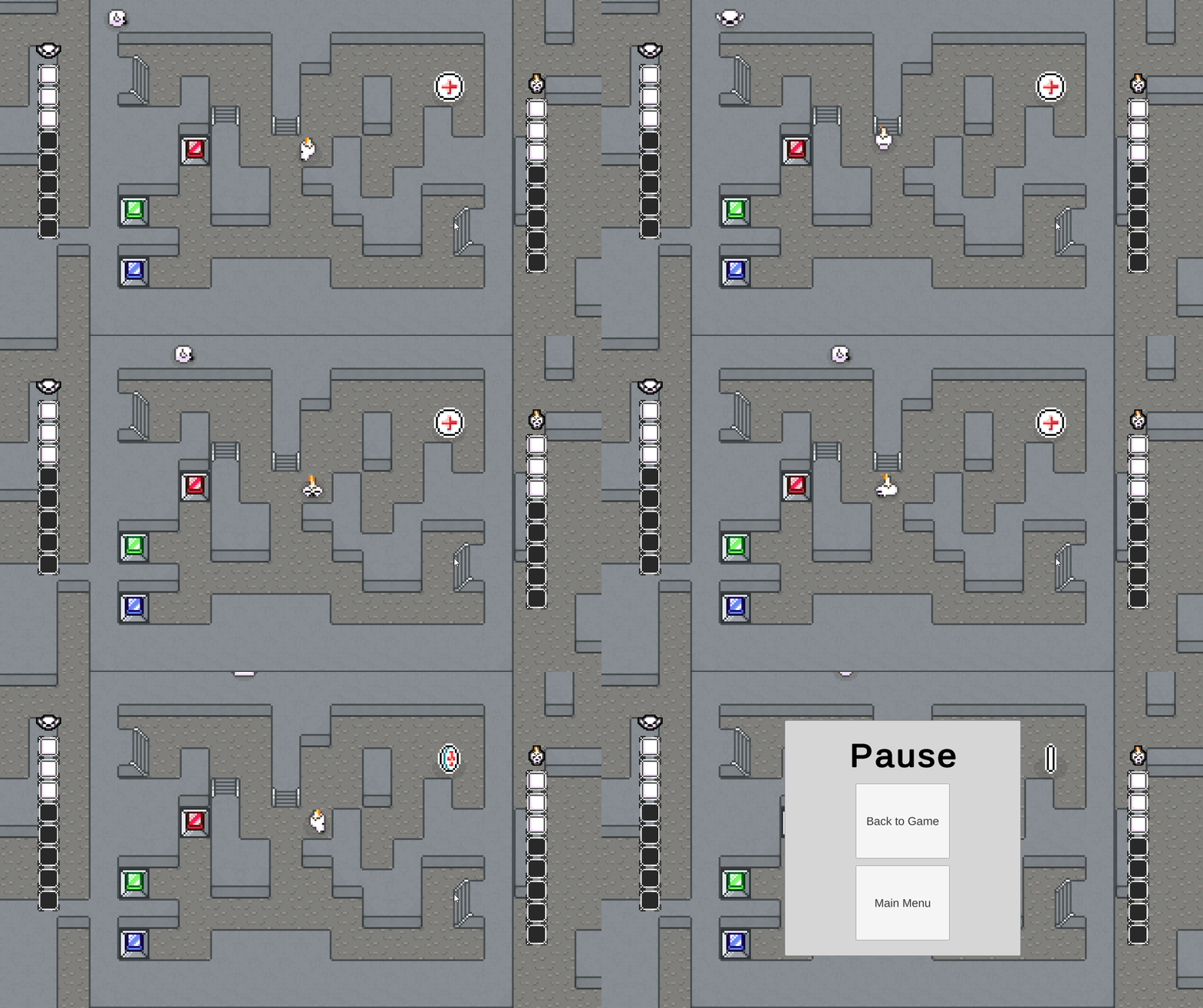
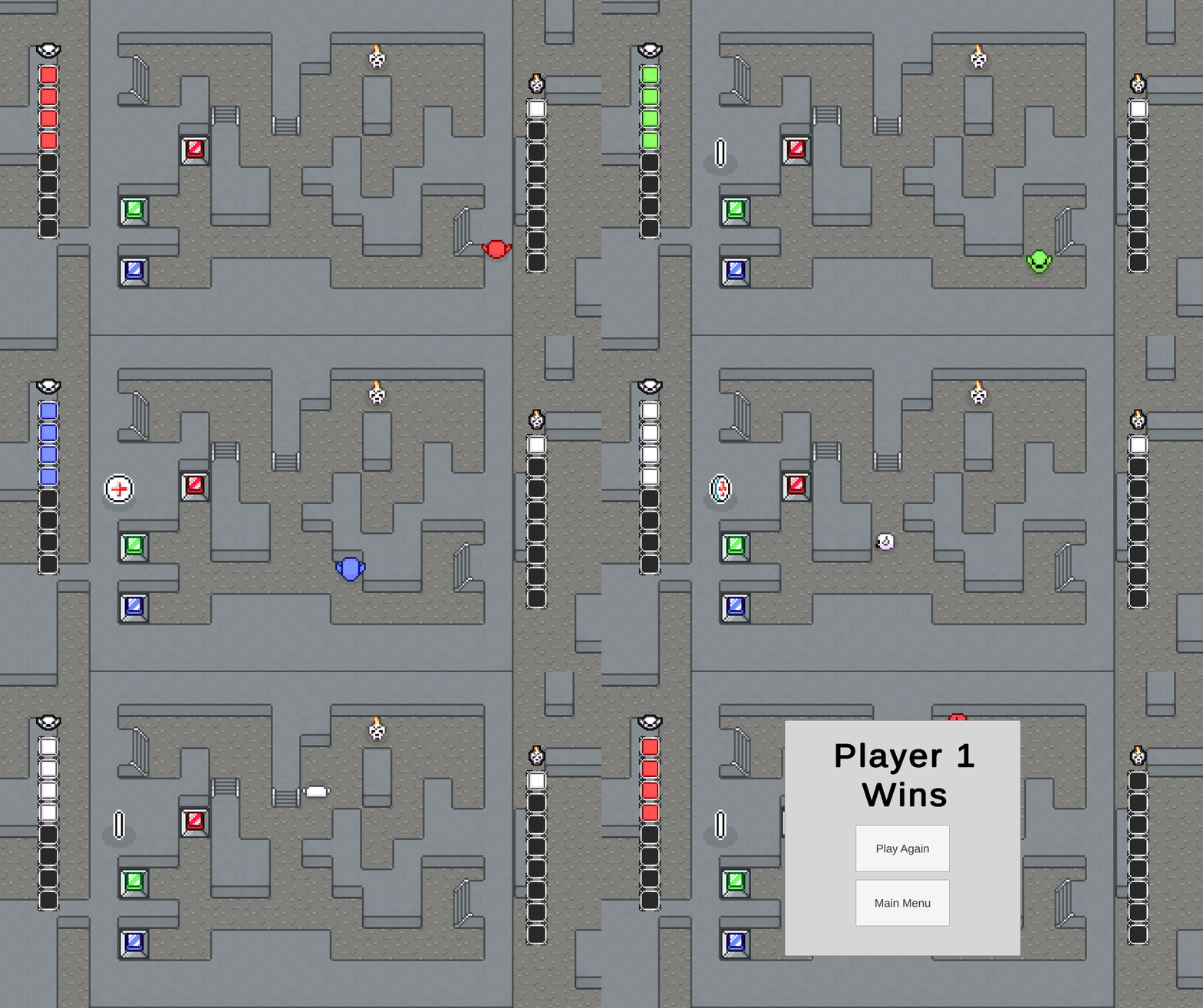
The pause menu arose as a way to combine functionality for stopping the game (in case someone needs to take a break or something) and returning to the main menu, since I'd noticed that the only way to restart the game was to reload it entirely. While one option on the pause menu is to return to the main menu, the pause menu can actually be called in the main menu itself. I figured this would be a good way to allow the user to reset any preferences they may have set wrongly on accident. The win screen is similar in that it stops the game and provides the user with two options, but in this case, the "Play Again" option simply restarts the level with the same players.
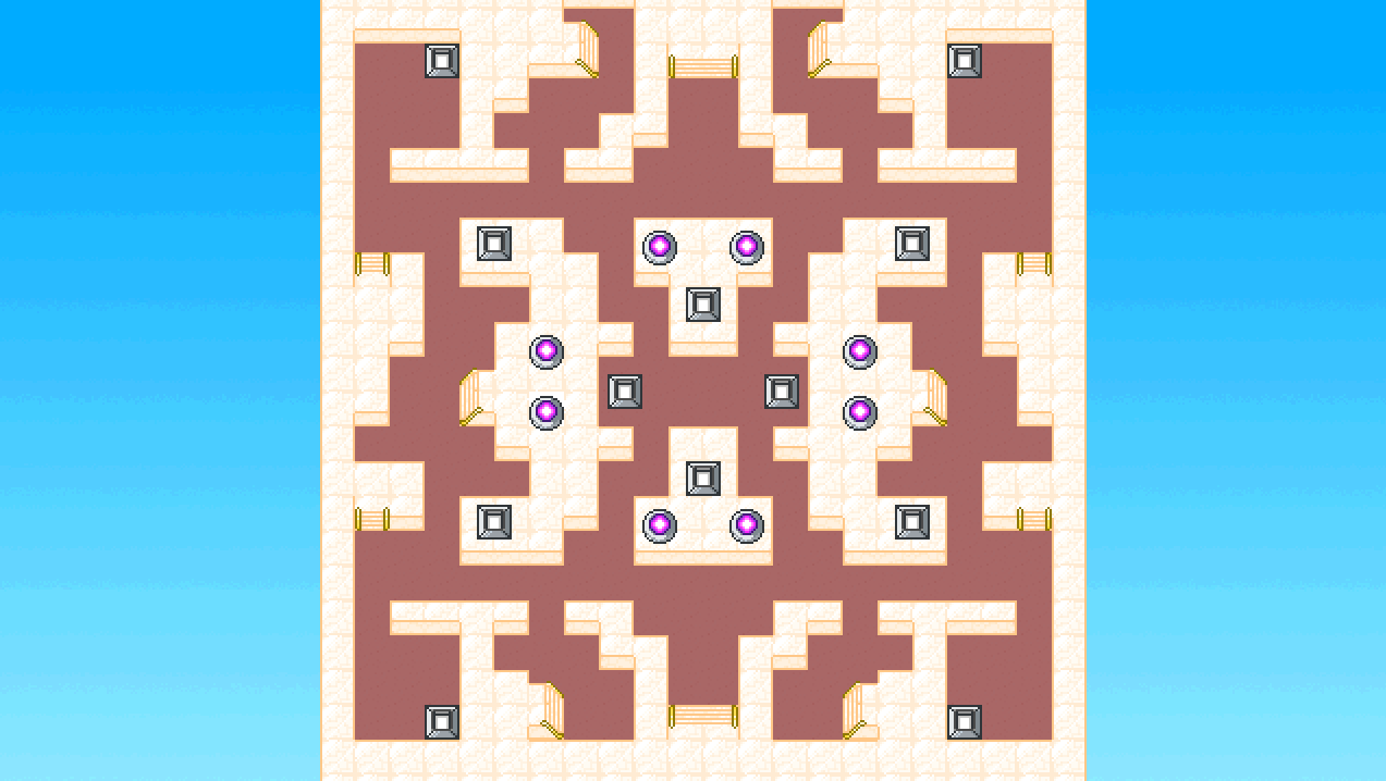
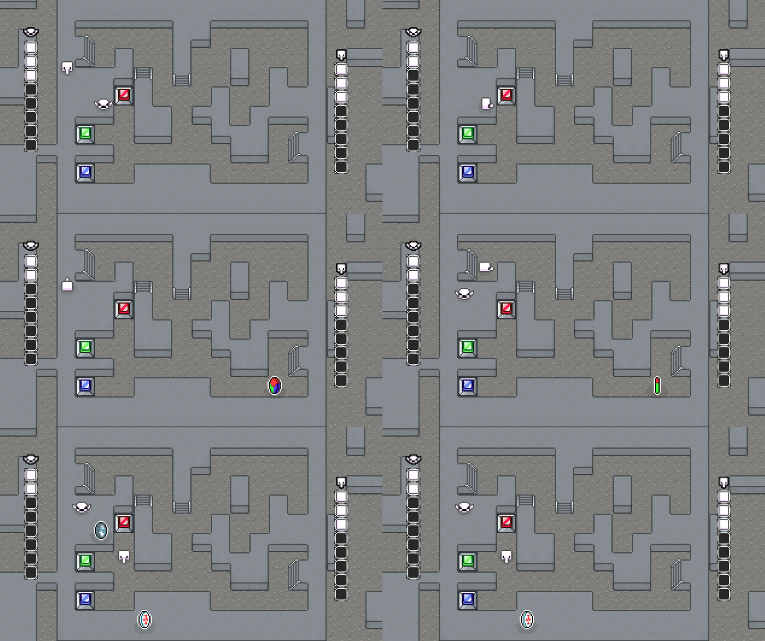
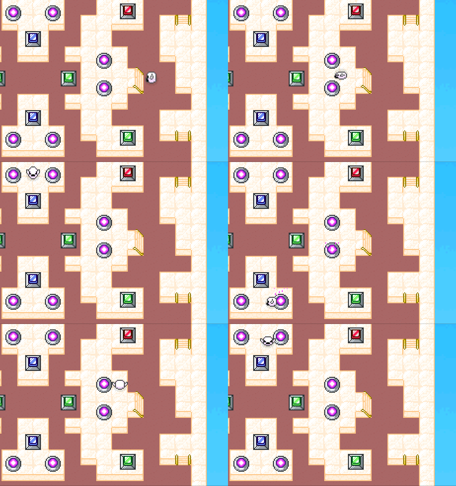
With the reintroduction of the original level, I decided I wanted to give it a fresh new tile set to differentiate it from the smaller map (now dubbed "Concrete Jungle"). In giving life to the freshly named "Sky Arena", I had in mind stereotypical heaven imagery as well as marble-clad Roman architecture (the word arena almost always brings the Colosseum to mind).
Less drastic graphical additions include new graphics for power ups, as well as animations for using the newly retextured teleporters and losing a life.
Feedback
Since I conducted a more extensive testing session this week, there's a lot more feedback to go through than usual. I'll just keep to the ones that are more relevant to the polish and UI of the game for the moment and address the others in more detail next week.
Some of the walkways are fiddly to get down.
It seems like the colliders in this game will be the bane of me 'til the bitter end. I might try making the players' colliders smaller by just a little more.
(Concerning Sky Arena) Choose more opposing colours, but with low contrast.
This is an interesting issue. On some monitors, the Sky Arena map seems blown out and hard to look at when on others, it seems fine. It's also down to how different people physically see, I would guess, in addition to personal preference of course. At the least, I might make the floor tiles darker to make the marble stand out more.
Adding a how to play in the main menu will add more information for the user to play the game.
This is something that definitely needs to get done. My relatively vague instructions in the game description are just not enough to give people a firm grasp on how the game plays, and working a "how-to-play" into the game itself is much cleaner and makes it more self-contained.
Bug (found) where the add and delete players disappears after 4 players are added
It seems as though this issue stemmed from the resolution appearing different in the Unity Editor to the final build, with the button to remove players disappearing after four players have been added in the players menu. I will probably make the individual player panels smaller to compensate.
Files
RGB Rumble
| Status | In development |
| Author | kiaric |
| Genre | Action |
More posts
- Devlog #6 - The FutureOct 17, 2021
- Game DocumentationOct 17, 2021
- Devlog #4 - Presentation and GraphicsOct 03, 2021
- Devlog #3 - Enemies and InteractionSep 26, 2021
- Devlog #2 - Basic level blockingSep 19, 2021
- Devlog #1 - Player MovementSep 12, 2021
- Game ConceptAug 29, 2021