Devlog #4 - Presentation and Graphics
Content
For the past few days, I've been working on graphics for RGB Rumble, as well as adding additional gameplay elements based on the game's outline and previous pieces of feedback. One of the biggest advancements I made during this time was the addition of the first proper tile set.

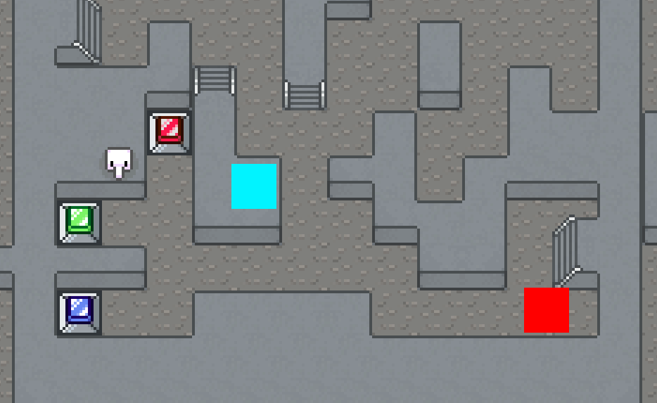
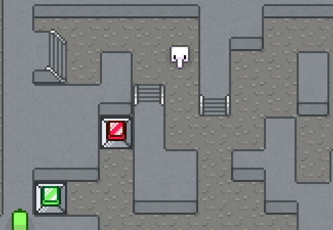
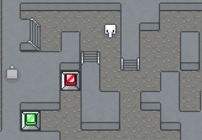
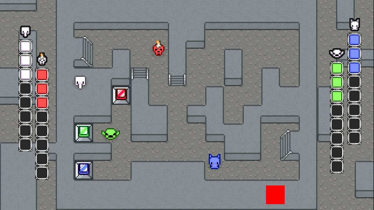
Using this tileset, I designed a new level to go with it. This map is smaller, simpler and more compact than the one I'd been working on prior. Its flow isn't complicated by any teleporters. Part of the idea behind this level is asymmetry, since I'd received feedback that the layout of my first level might benefit from asymmetry to make it a bit more interesting. I was already happy with the overall layout of it, however, but it gave me ideas for the map you see before you now. The idea of grouping all the calibrators in one place was decided on to encourage the frantic and back-and-forth gameplay I'd imagine this level would invoke. It did occur to me that the first player that would reach the calibrators would be at a massive advantage with how the game played at that stage (probably locking said player into an easy victory), which is why I decided that I also needed to finally implement my first power ups.
One of the most challenging aspects of implementing power ups was having them drop in locations that made sense. It'd be no use for a power up to drop in a place a player can't get to and it'd be confusing for one to drop directly on a player, giving them the effect without warning. I figured out a system that (every few seconds) checks to see if the position it's trying to spawn a power up at has colliders nearby (e.g if the location is right by a player or in a wall), picking a new position if it does. With this system in place, power ups seem to drop in appropriate places almost all the time.
As for the power ups themselves, there are currently three, each with a simple, coloured square placeholder graphic for the moment:
- Invincibility (green)- the player alternates between all the colours and can take out any other player regardless of their colour, but when the power up has timed out, they'll be set back to white.
- Health up (red)- the player gains an extra life.
- Ghost (blue)- the player becomes transparent and can harmlessly pass through other players.
During my time this week, I've also reached the important milestone of implementing unique graphics for each player.
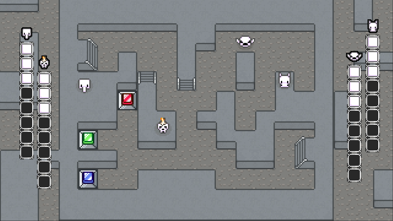
This differentiation between the players is essential for moving forward, so getting it implemented was a priority. Along with using their various sprite sets for animation, I also used their front facing sprites as little icons to go above their respective health bar to clarify whose is whose. Speaking of the health bars, I've tweaked their design a bit since my last update and now they're capable of changing colour to match their respective player.
I've made a few other miscellaneous graphical tweaks, too, including changing the border colour of the player palette to be darker to better stand out against the background and the addition of a shadow underneath each player.
Feedback
Having to let go of a movement key to use another one feels a little weird. Like, if I hold down left, I go left, and then if I press the up key, I keep going left rather than going up.
Man, I love the jiggle as they walk. Really cool!
Though I didn't get much feedback this week, I'm glad to hear that the new graphics have been generally well-received.
The point about the controls is something I was aware of, but I chose not to pursue fixing it out of a previous lack of concern or justification (there were more important things to be working on). However, now that attention has been drawn to it, it does seem that the way the movement in RGB Rumble is implemented might clash with prior experience; in many other games with 4-way movement, pressing more than one key usually changes the movement to match the last key pressed, but in this stage of RGB Rumble's development, horizontal movement always overrides vertical movement (for example, pressing the left key, then pressing the up key with both still held down will not make you move up, but left instead). This is something I should consider working on soon, since I don't believe the solution should be too difficult.