Devlog #1 - Player Movement
Content
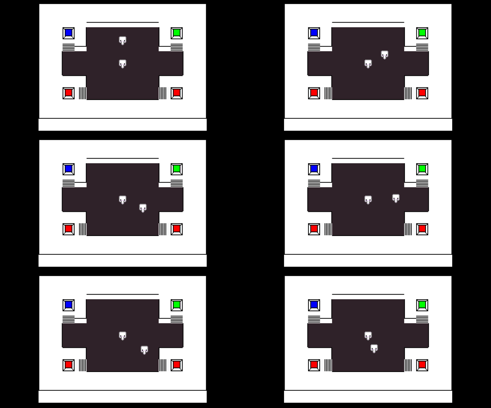
This week has been focused on implementing basic player movement, and basic is indeed the word. RGB Rumble, even in the days of its 3D predecessor, was never intended to have a particularly complicated movement system. In the predecessor, the player was controlled by a set of keys or by a game pad. The horizontal axis (e.g the left and right arrow keys, or lateral joystick movement) would rotate the player one 90 degree rotation to the left or right while the vertical axis (e.g the up and down arrow keys, or vertical joystick movement) would propel the player either forwards or backwards.

I decided in favor of simpler controls for RGB Rumble, since the old controls were unintuitive to everyone that had played the old version of the game to the point where even I would get tripped up by them fairly often.

The game controls much simpler now, with each player controlled by their respective horizontal and vertical axes (currently by WASD for Player 1 and arrow keys for Player 2). Like in its predecessor, movement is still locked to the four cardinal directions. I believe this limitation better reflects the game's inspirations and adds another level of challenge to pursuit and evasion between players.
Another aspect of movement that changed between RGB Rumble and its predecessor is the removal of jumping. You see, the predecessor of the game had upwards movement in the form of what was essentially an afterthought jumping mechanic.

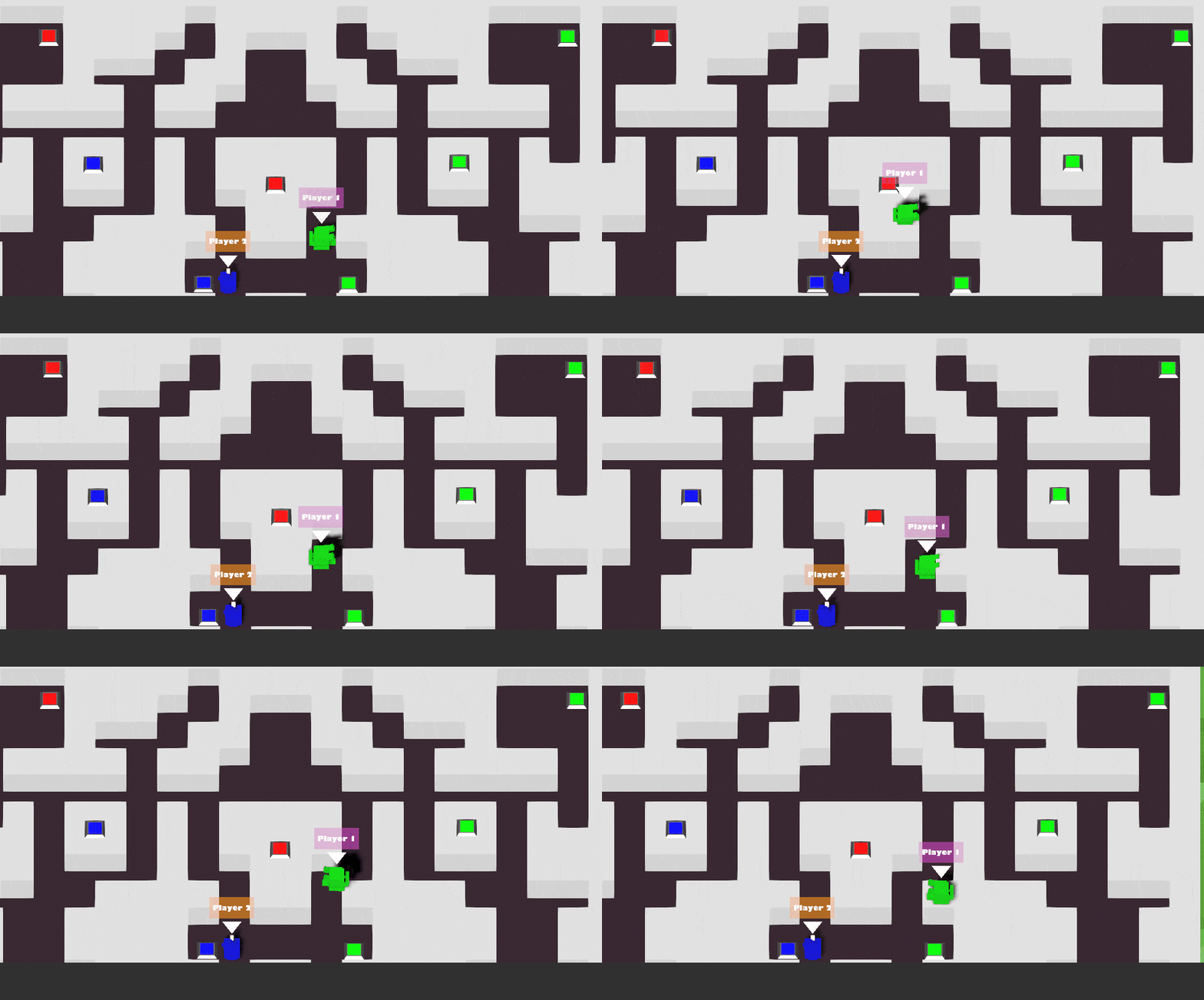
There are several reasons why I decided not to implement jumping in RGB Rumble. Firstly, with the perspective in the original game, jumping movements were already indistinct enough. In a topdown 2D style, they would be even more so. Secondly, in the new style, jumping would be much harder to implement since it lacks a functional upwards dimension. I would have to somehow come up with a system where jumping shares the y-axis with movement and the level has some kind of depth factor to figure out if a player could jump to a specific place.
I did, however, like the multi-leveled aspect of the old game's arena, so I decided I would implement a higher level through stair tiles any player can simply just walk through as well as edge-specific colliders on certain tiles.

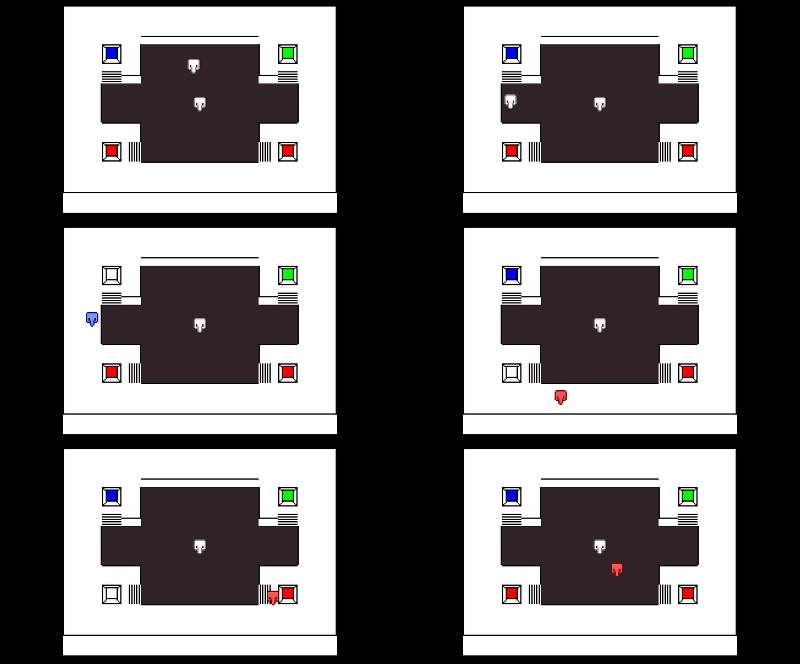
As can be seen in this image, this week has also been spent working on basic but fundamental game mechanics, such as the mechanism for changing colour and the players' colour changes themselves.
Feedback
Movement seems nice, potentially making the colliders a bit better might be nice
Making so the wall boundary is a little closer to the actual shape of the sprite would be nice
The movement feels smooth and has a good speed. I agree that the colliders on the players are perhaps a bit too large
Movement is nice, feels smooth and has no issues.
It feels like the colliders might be made bigger for sprite rotation/movement?
So far, playtesters seem to have just one issue with movement at this point in time, which is the size of the collider on the player sprite. I can understand why this might feel off, since the collider is slightly under 16x16 pixels in size while the player sprite was designed to fit inside a 16x16 space. This means that when the player meets an obstacle, they will fall slightly short of actually appearing to touch it. I kept it this way to allow for future animations that may go outside the bounds of the default sprite.
I think there are a few different ways I might go about solving this in the future:
- Fit the collider to the default sprite. This might cause the player character to seemingly clip into objects slightly when animated, however, depending on how much space the various animation frames take up, that might also be a non-issue.
- Change the collider size dynamically at run-time. This solution will ensure there are no compromises when it comes to player collisions, though it would take a bit of work and might chew through a bit more processing power. Given the simplicity of the player models, however, it shouldn't cause that much of a problem.
- Fit the collider to the largest extent of the player sprite. Depending on how large the largest frame of the player animations might be, this may provide no obvious advantages over leaving the collider as is, though if it falls short of the original size of the collider, it might be a good compromise between the other solutions.
- Leave the collider as is. This was my original idea and the overall issue is not a particularly major one, but I think getting it out of the way at some point will be for the better.
RGB Rumble
| Status | In development |
| Author | kiaric |
| Genre | Action |
More posts
- Devlog #6 - The FutureOct 17, 2021
- Game DocumentationOct 17, 2021
- Devlog #5 - Polish and UIOct 10, 2021
- Devlog #4 - Presentation and GraphicsOct 03, 2021
- Devlog #3 - Enemies and InteractionSep 26, 2021
- Devlog #2 - Basic level blockingSep 19, 2021
- Game ConceptAug 29, 2021